Top 10 Tips for a Designer Finish
There are so many considerations and decisions with any renovation project. Once all the plans and the structural work is sorted, it’s a good idea to start to thinking about how you want the finished product to look. The interior of your project needs careful planning and consideration too to ensure the finished spaces work for you and your family – and that your finished renovation is one you love! Here are 10 tried and true tips for a designer finish for your home.
1. START WITH A PLAN
Like any project, time invested up front saves time and money down the track. Plan your “look” with a moodboard to help you visualise the end result. Use Pinterest or simply cut images you love from magazines. Look for the themes in the images you’re drawn to – colours, style, lines, texture, mood. Having a clear vision will prevent impulse buying and ensure the finished space works as a whole.
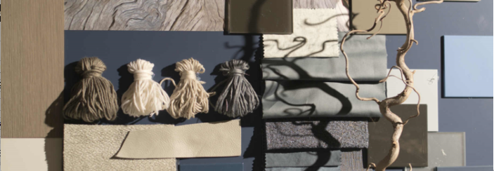
2. PICK THE PAINT COLOUR LAST
Yes, paint can transform the look and feel of a room, but it really is the backdrop that should complement everything else in the room. There are absolutely thousands of paint colours – you can even create your own bespoke hue. So start with other finishes that are a bit more complex – flooring first, then window furnishings, upholstery, rugs, artwork. And then choose the paint colour that best complements the room.

3. LESS IS DEFINITELY MORE
Before you start styling any space, do this first: declutter. Clear away all those non-essential items so you have clear spaces. Then thoughtfully and deliberately select special pieces to display that have maximum impact.
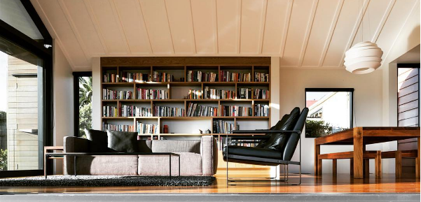
4. CREATING A FOCAL POINT
Once you have decluttered and have your “canvas” ready, think about what is going to draw attention in the room. What is going to anchor the space? Is it the view? A piece of art? A fireplace? A rug? A headboard in the bedroom? Choose your star and allow other items to take a secondary role – this ensures the room has balance, not clutter and visual noise.
5. NEUTRALS AREN’T BORING
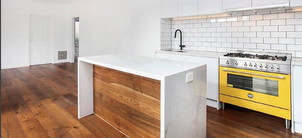
Neutral decor can be interesting – just include a variety of materials and textures. Think about layering linens, velvets, leather, marble. It's ok to layer whites with creams, greys and taupes – just make sure the fabrics, finishes and colours selected all tone and complement each-other. Another trick is to add black accents for a sophisticated look – legs on tables and sofas or maybe in architectural features like the joinery.
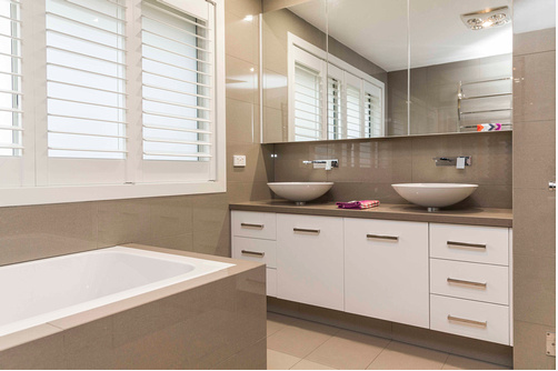
6. DON’T SKIMP ON THE SOFA
If there’s one item of furniture to invest in (besides your bed!), put your money into a comfortable, well-made sofa that you’ll have for 10 years or more. Don’t postpone a sofa makeover because of your kids! So many fabrics are now stain repellent and will more than pass the kid test. Tip: A custom sofa doesn’t need to cost that much more than something you’d buy from a retailer – and you’ll get a sofa in exactly the fabric, style and size you want.
7. STYLE YOUR SURFACES
When a styling a coffee table, shelves or sideboard, use oversized pieces that have dramatic effect, rather than surfaces cluttered with lots of smaller items. Start with something large and beautiful in the middle of the surface. You could start with flowers or branches arranged in a vase. Then build out from that – a stack of books or magazines, a candle and another treasure. If you truly love something, put it on display – use and enjoy treasures from travels, family members or antique hunting. Make it interesting, think about proportion and playing with scale – and change it regularly. Tip: Coco Chanel said about accessorising: “Before you leave the house, look in the mirror and take one thing off.” A key part of styling is editing too – when you’re done, stand back and try to critique the space objectively and then edit – move and remove until it works.

8. ADD TRAYS
Instead of displaying books, objects or vases of arrangements directly on your coffee table or console, style them in a tray for a more finished, deliberate look. It’s a great way to group smaller items together to make a statement. A tray can contrast or compliment the other accessories – think acrylic, metallic, marble or glass.
9. CUSHIONS FOR EXTRA LUXE
The best way to make a sofa look more luxe is by adding some fab cushions. Cushions are a great way to add colour and texture to a room – look for special fabrics. One pair of cushions always looks skimpy. Use two pairs per sofa in contrasting patterns, colours and textures. Switch up the sizes and shapes so they’re all not exactly the same – like a larger square cushion with a smaller rectangular one. And think big – your cushions should be at least 45 x 45 cm.
Tip: Always go for a feather inner – they don’t cost that much more but look and feel so much more luxurious. And it allows you do that fab designer trick – the cushion karate chop! (that's a way of shaping cushions using a karate chop to create an indentation in the top. You heard it here!).
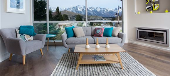
10. BE BOLD!
Personality is what makes a space unique and special. Incorporating personal style and pieces with a story are what turn an average room into a stunning one. Don’t be afraid to make your own statement! They don’t have to overpower the room, but they’ll give it edge and personality. It may be a dramatic fabric for your cushions, an amazing piece of art, a rug brought on overseas travels, a grandparent’s special chair recovered in an amazing fabric.
Be brave enough to be yourself, not just following the latest trends, and then you’ll create a home you’ll still love for years and years to come.
Have fun putting these tips into action in your next home renovation!

