Choosing a colour palette for your renovation
Smith & Sons’ unique Design – Plan – Construct process integrates the various stages of a renovation project, meaning we manage the entire process from start to finish and save you time and money!
The first stage of the renovation journey, ‘Design’, is the creative one. We venture to find out all about you, your living situation, your family and even your pets! With this in mind, we then explore ideas, designs, materials, colours and a myriad of other items that suit your current and future living situations.
When it comes to colour, we often refer to our friends at Dulux and what they deem the 5 key elements to creating a colour palette. They are:
1. Temperature
Turn up the temperature or keep it cool with the use of colour. Colours are divided into two groups – warm and cool. Your choice of colour will impact mood and depth perception, so it's important to decide if you want the colour to recede or provide a strong focus.
Warm colour such as red, yellow and orange evoke warmth because they remind us of things like the sun or fire. These colours draw attention to the space and are a strong focus in the overall look of the room.
Cool colours such as blue, green, and purple evoke a cool feeling because they remind us of things like water or grass. These colours are softer to the eye and will give you a feeling of a larger space within the room.
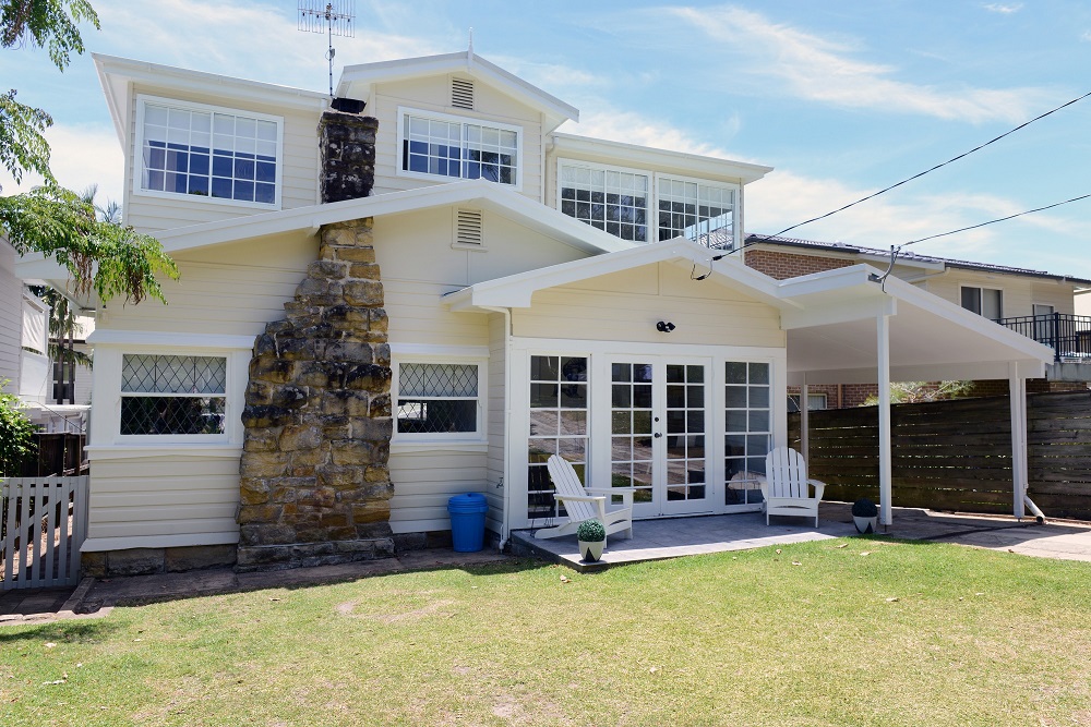
Warm colours on exterior of home by Smith & Sons Manly
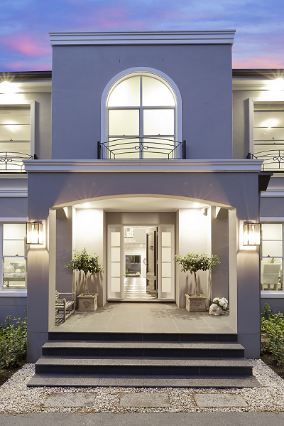
Cool colours on exterior of home by Smith & Sons Castle Hill
Click here to explore colours from both colour groups.
2. Tone
This refers to the lightness or darkness of a colour. Adding black darkens tone, adding white lightens it. Light tones give an airy feeling and can make a room appear larger while dark tones evoke a mood of sophistication and elegance.
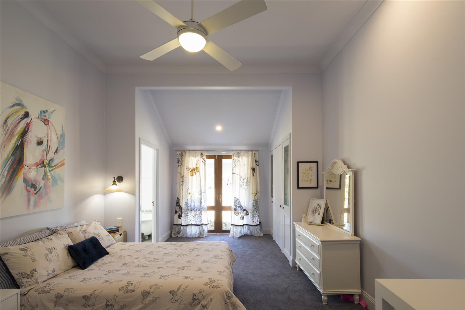
Light tones in bedroom by Smith & Sons Newcastle
3. Hue
Hue is another word for colour and is the foundation of any colour scheme. Hues can be Primary (red, blue and yellow), Secondary (mixes of two primary colours) or tertiary (combinations of primary and secondary colours)

4. Lighting
Natural and artificial light impacts the way colours present themselves. Bright rooms flooded with natural light, look great with cool whites and neutrals while warmer whites brighten up dimmer or south facing rooms.
%20-%20Copy.jpg)
Natural light in extension by Smith & Sons Ryde
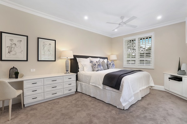
Artificial light in internal renovation by Smith & Sons Turramurra
5. Chroma
Chroma literally means 'colourful' and 'bright' and refers to the intensity of the colour. Chroma colours are bold and make a room or surface pop. They are best used on feature walls or focal points like a front door.
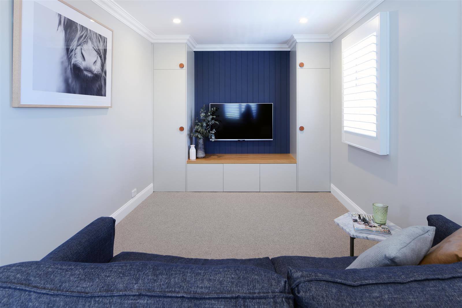
Chroma colour on feature wall by Smith & Sons Hornsby
Dulux is a premium partner of Smith & Sons NSW. Contact your local office today to start your renovation journey with a team of reliable and professional builders and tradespeople.

